E3 – Creating a Brand New Look For Senior School Dining
21/03/2024
Let me tell you design story, one about creating an inclusive, shopper focussed and visually vibrant brand identity for school dining areas, one which positively enhances the overall dining experience for its customers. The story begins approximately two years ago when one of our clients came to us with the challenge of transforming their ok catering proposition… Cue all the effective design words such as research, strategy, engagement, tone of voice, data, imagery, food choice, the list is rightly endless, effectiveness doesn’t just materialise on its own, there is a design science behind it, one which creates a seriously weighty rationale to how the design ends up. Ours is to Explore Define Generate Evaluate, or in short we will give you the E.D.G.E.
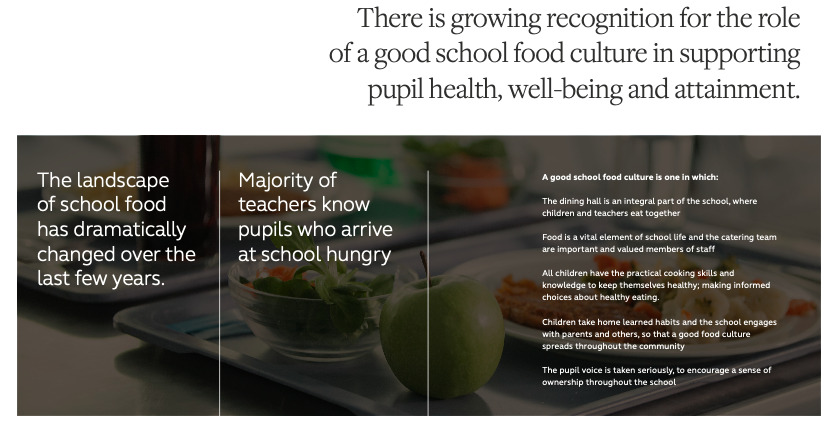
When we set off on this branding journey, our data and research screamed out the importance of creating a different experience, one which would stand out and encourage pupils to come together and socialise over a wide range of freshly made, quality food choices. Having made a lot of site visits to a range of schools, attended some online forums and updated my understanding of the latest school food trends, we set to work on laying the design foundations of our identity. When you are designing any kind of brand identity the early stages are by some considerable margin the most important, whatever strategy appears from the initial stage, shapes and forms everything thereafter. If we had skipped any of the initial phases, we wouldn’t have been abreast of the current school food landscape, understand the role of teachers, pupil eating habits, staff challenges, equipment etc, so therefore be able to drill down into why we felt is was critical for our identity to over time, support the creation of a better food culture. Below are just a few of the key in sights we used to shape our design thinking, from these we developed a design mantra of “the Whole School Approach” this took us on wild and wonderful journey beyond the classroom.

It is always a daunting task to create a name, a brand and its identity for an institution like a school, as there are so many personas to cater for, the no’s always heavily out weigh the yes’s, but because we had done our research, nailed down the strategy and our design approach, we had direction, you absolutely cannot proceed into creating a mega brand identity with a “I will know it when I see it” attitude, clients do not have the shopper marketing knowledge, or design expertise to make these type of decisions, after all its why us design experts have been employed to do the work in the first place. What our clients do have, is the ability to love, and get behind a strategically melded design route that has been designed taking into account our key insights, this was exactly the case when we presented E3 / Everything for Everyone, Everyday! Please see the below snapshot of concepts that won our initial design stages, the concepts are born from the data, research and insights which is why we all felt E3 absolutely nailed the overall vision.

Our design studio completely comes alive at this point, with F&B design specialists collaborating with the client services team and the client to design and develop our concept visually and verbally. Using the front end data and research, the strategically picked name and our experience, we start the process of laying down key arts, exploring language, testing colour palettes and image type and layout. Effective design needs to attract and engage with its audience, seems obvious, but it’s amazing how many designs miss the objective because the agency doesn’t push the agenda, or articulate why the colours are correct. An example of how to challenge that negative voice in the room if there was on in the E3 presentation (there wasn’t by the way) could be ‘this brand needs to attract and engage with, in the main 11 – 16yr olds, we are so glad you don’t connect with what we are presenting, you are of a certain mature age, most likely listen to Pink Floyd on repeat, so thank you for confirming our design nails your chosen target market.’ For E3 our client took the creative home to families, and around schools they have contracts with during key gates of the design process, to confirm in their minds the design rationale was as good as we told them it was. The response was something along the lines of ‘WOW’ wish my school dining area looked liked that.


We felt it was important to adapt the brand for the older pupils, the sixth formers, the young adults who were about to fly the mainstream nest into the big wide world, or off into the realms of higher education. This is all part of the ‘effectiveness’ strategy when professional F&B designers collaborate and apply shopper marketing experience, the more vibrant, obvious images and straight forward tone of voice will not be as effective with this shopper than it will for the main school, so we evolved the E3 brand into a more premium looking, adult feeling execution as we knew this is what our shopper would be attracted to and therefore engage with, this was proved to be correct when measured through till conversions and spend per head.

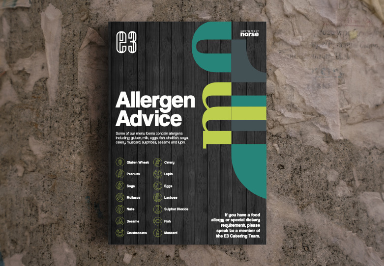
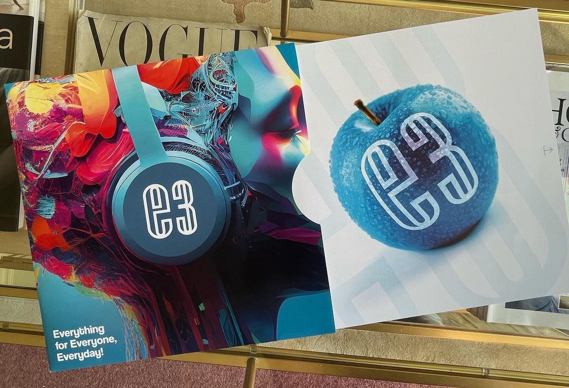
We have our brand identity designed, it has been tried and tested within the area we will be launching, all of our design ducks are in a creative row, we now need to provide the client with some marketing collateral to go and sell the concept into schools, more creative fun times ahead, and boy did we enjoy this. Fair play to our client Southwest Norse too, they understood the benefit of spending a bit of money on this phase too, let me introduce you to our marketing hero of the hour, a record sleeve brochure (remember them?) we designed, artworked, produced and delivered for our wonderful client to help sell the brand, overall, it communicates the values, features and benefits of how E3 will transform your schools dining experience. When pitching anything really, it is so so important to be perceived as innovative, on trend and ooze quality, if this is how the the pitch went, imaging how the food is going to taste, being the objective message to convey.
We are a full service creative design agency whom specialise in Food and Beverage, full service for some means we complete the design phases and handover to others to mobilise, we don’t, there is always a shop fitter, decorator, or graphics contractor wanting to cut corners, make round corners square or do one coat of paint instead of two! We choose to project manage every step of the installation as well as the design, over the years we have found the end results to be better, our clients prefer it, but most importantly, we can design with a view to installing, this eradicates the designer visuals that have floating shelves, walls without fire exit signs or power sockets and weirdly proportioned items that on delivery look nothing like the visuals originally presented. Our graphics team of designers and artworks often steal the show as this is the part that people physically see after project completion, but for me it is a team game, without all of the aforementioned we would never get to the graphics stage, even though the accolades filter down the project chain and end up on the project managers lap, which for all F&B projects D2 deliver is myself. The best way to visualise how we have transformed the dining environments by mobilising E3 is to show before and after visuals of our most recent E3 work.
Main dining hall at Ivybridge Community College – Designed, Surveyed, Artworked, Produced, Installed – Mobilised by D2 F&B Creative over Feb 2024 half term.
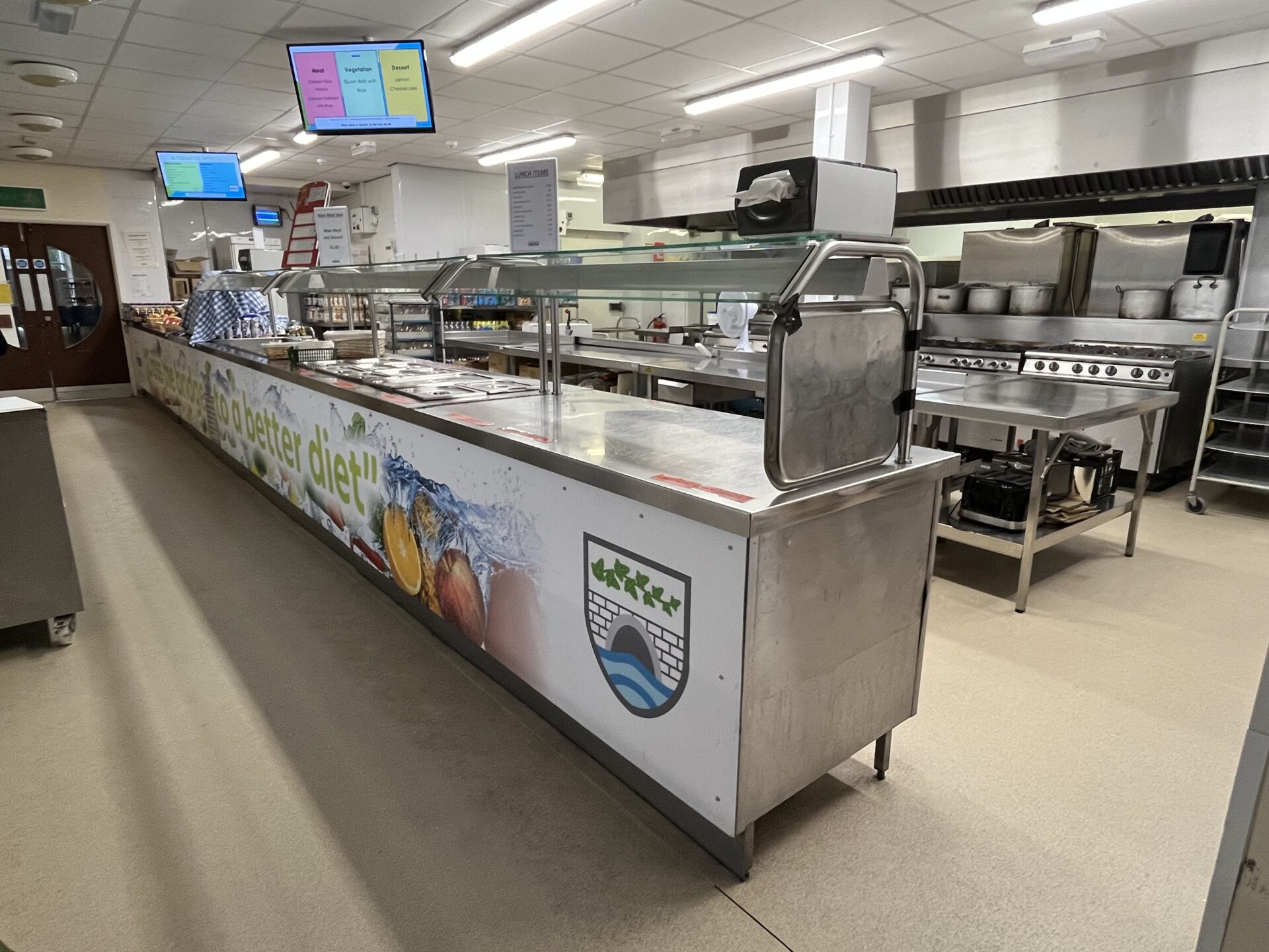
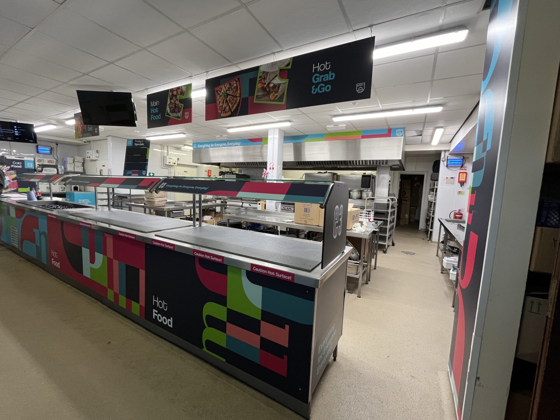

Dining counter at Ivybridge Community College – Designed, Surveyed, Artworked, Produced, Installed – Mobilised by D2 F&B Creative over Feb 2024 half term.
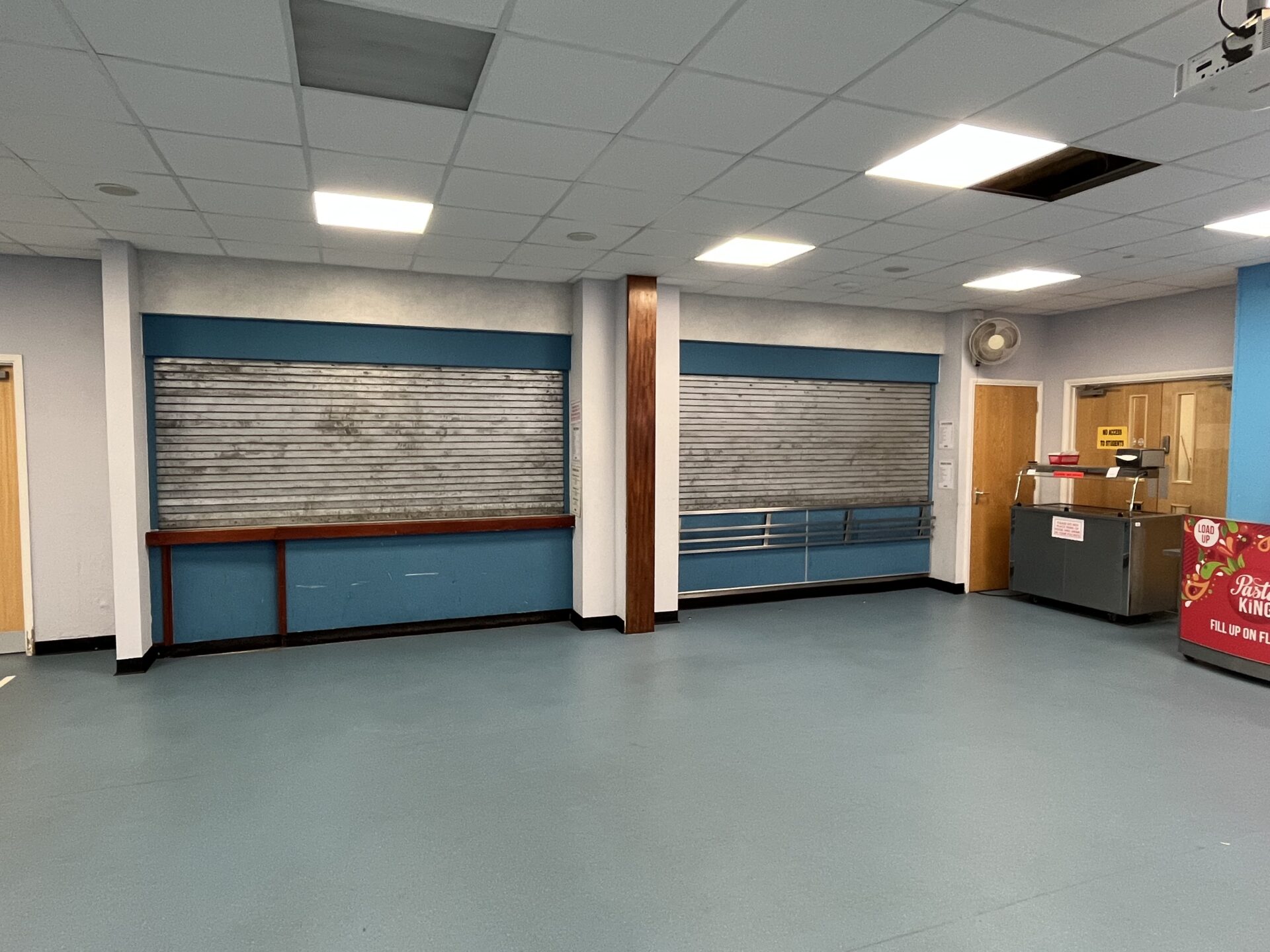
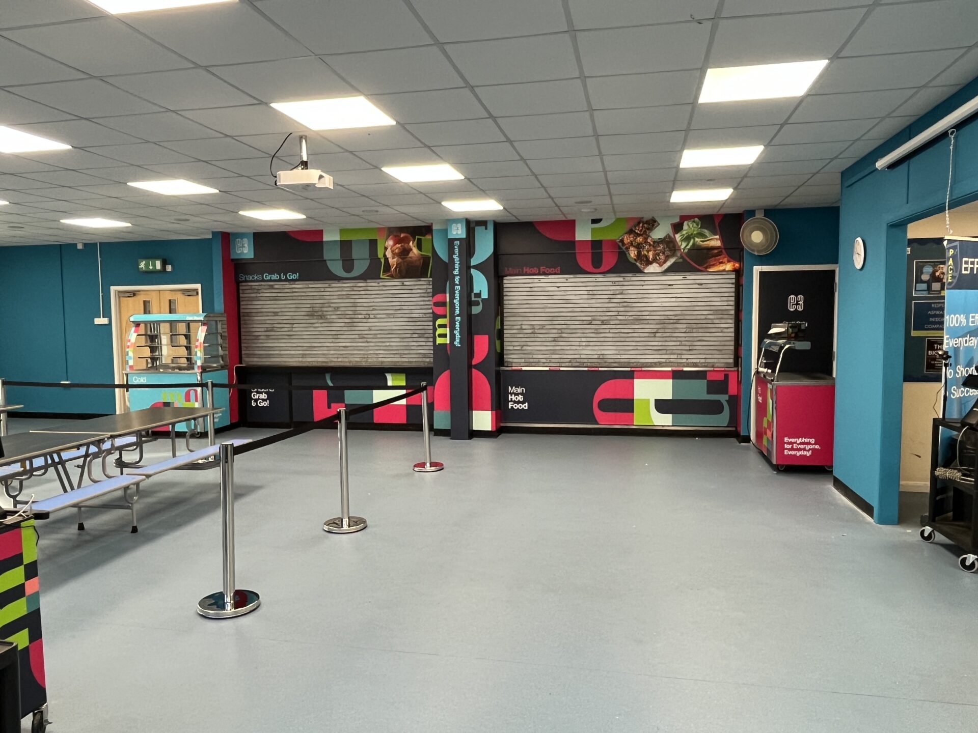
Sixth form outlet at Ivybridge Community College – Designed, Surveyed, Artworked, Produced, Installed – Mobilised by D2 F&B Creative over Feb 2024 half term.
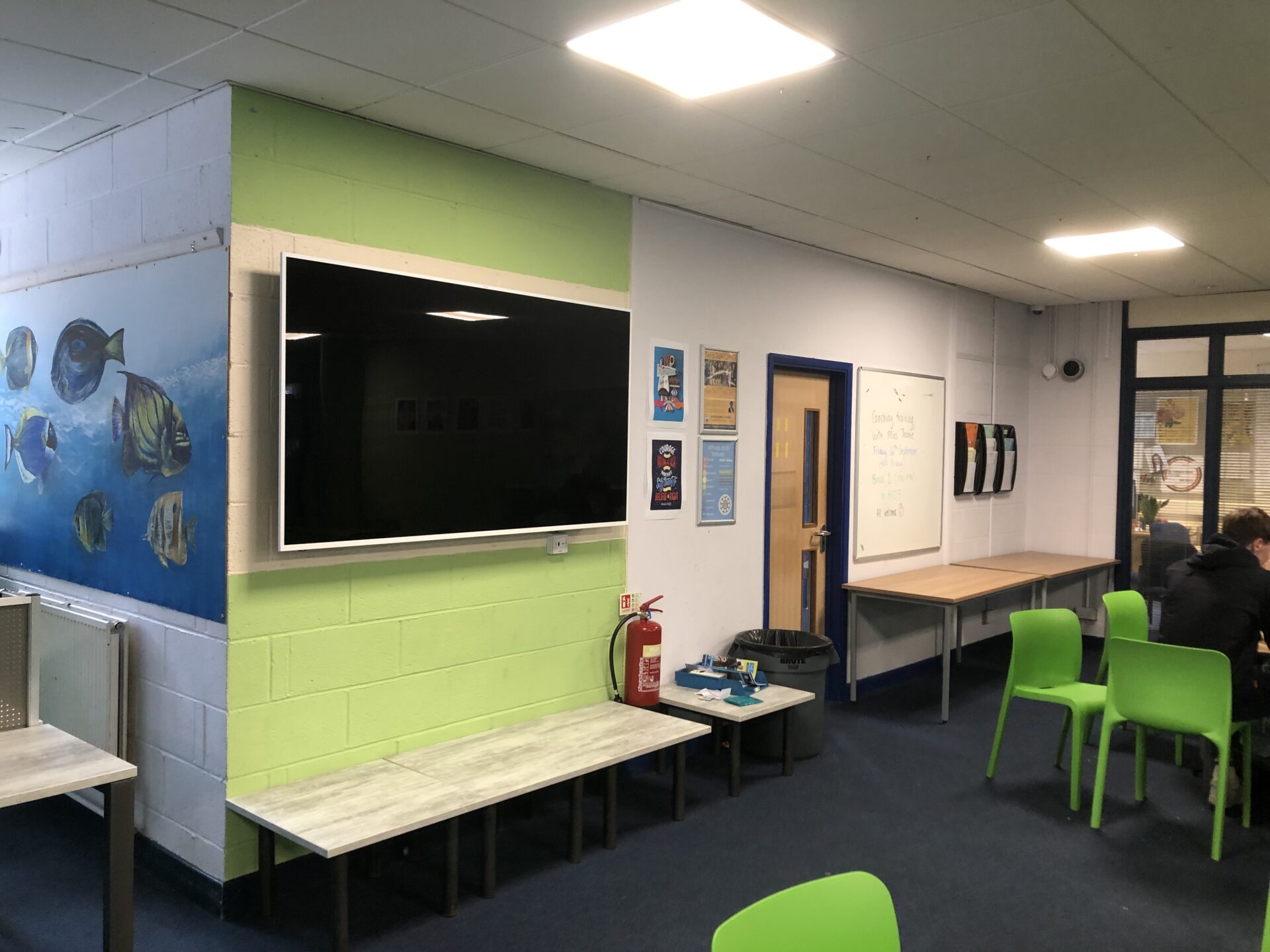
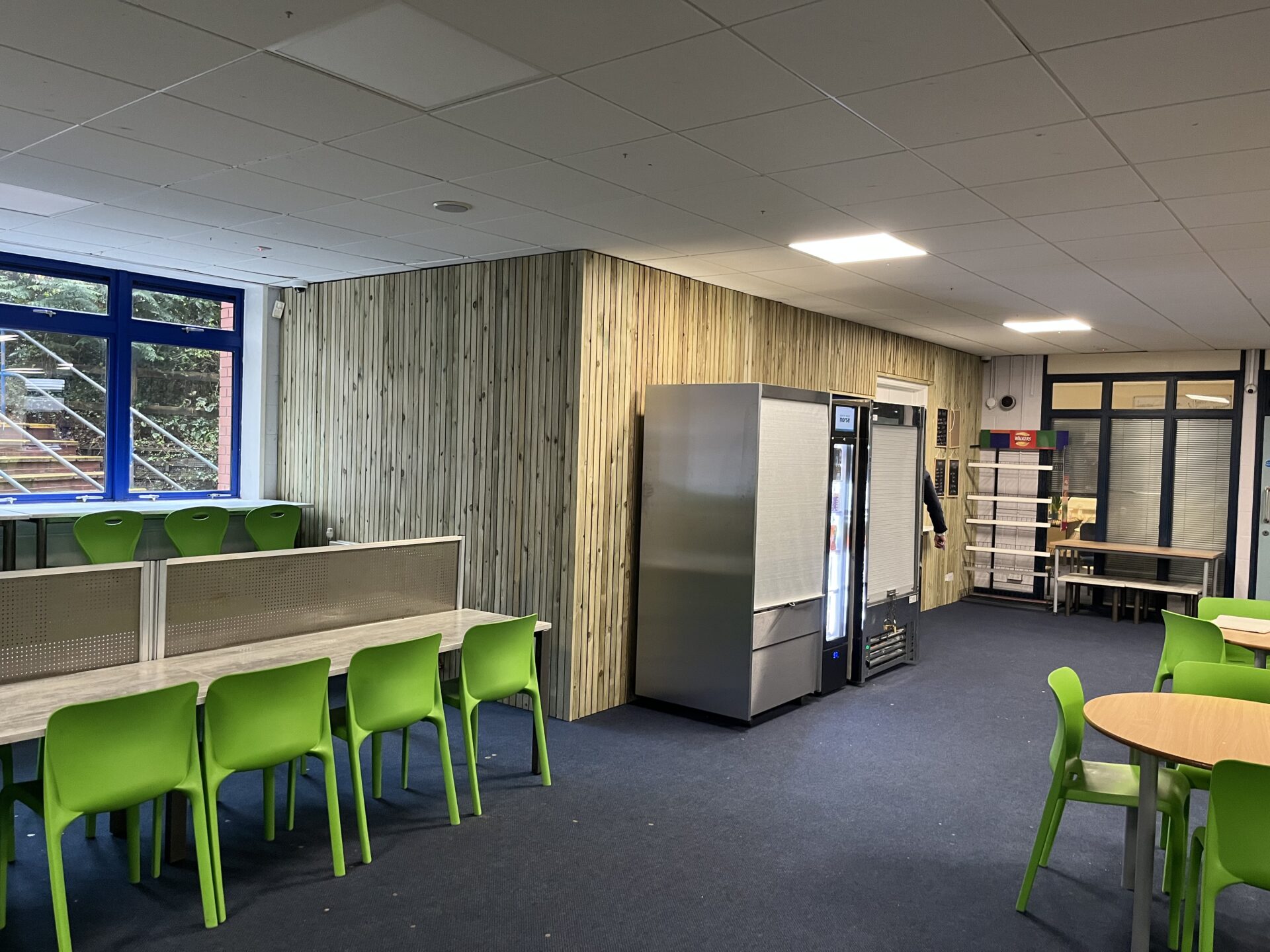

In a conclusive nutshell, we couldn’t be happier with the way our design process has led us to create a game changing brand identity for the senior school market place, with our E.D.G.E mantra shaping our design, we are confident our design will stay on trend, be competitive against our peers and always sell. You don’t need to take our word for it either, wherever we have been the sales numbers prove it.
I hope you have enjoyed reading about our design process as much as I have enjoyed writing about it, design can be so subjective, so opinion based looking from the outside in, hopefully this top view description will help educate some readers on some of the processes we employ on a daily basis to ensure we always deliver ‘effective design’
